
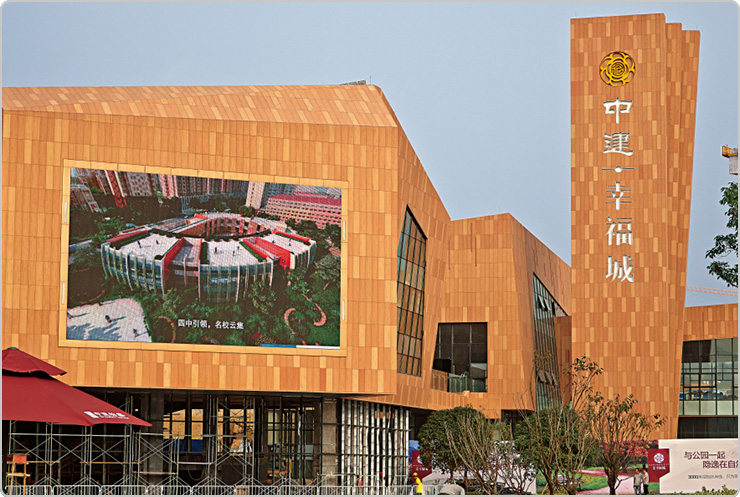
A narrow street frontage makes every joint visible. Terracotta panel orientation can help a small facade feel calm, tall or closely connected to its neighbours. The useful choice depends on the shape of the remaining wall, the entrance and the viewpoint from the pavement. It is rarely a matter of turning the same rectangle through ninety degrees.
For a compact shop, small office entrance or infill building, compare three compositions before choosing a module: horizontal courses, vertical fields and a limited change of direction. Keep the openings and overall building outline identical in each study. This makes the effect of the panel arrangement much easier to judge.
Read the wall that is actually left
A frontage may look narrow on a site plan but offer very different areas for cladding. A central doorway can leave two thin piers. A wide glazed entrance may leave only a band above it. A recessed doorway can create a deeper return that matters more than the front face.
Start by identifying those solid areas. Then ask which should read as one piece. If the two side piers and the band above form a clear frame, a continuous material can hold them together. If one pier contains the entrance sign, it may deserve a distinct emphasis. Neither choice follows automatically from the building width.
Draw the surrounding shopfronts as well. A narrow infill facade can establish its own identity through texture and colour while still respecting a useful neighbouring line, such as a canopy or the top of the ground-floor glazing.
Horizontal courses can connect separate pieces
Horizontal joints can carry the eye across a frontage. They can also connect wall fragments on opposite sides of a glazed opening, especially when the courses resume at a consistent level. In a small shopfront, this can make the cladding read as a background to the entrance instead of several isolated strips.
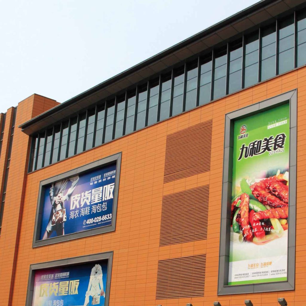
The photograph illustrates a joint rhythm on a larger building. For a narrow frontage, the design question is whether that rhythm has enough uninterrupted wall to remain legible. Very short pieces at every edge can make the pattern feel busy. A few well-proportioned courses may be more convincing than a dense set of lines.
Watch the band above an entrance. Strong horizontal subdivision there can reinforce a low, broad shape. That may suit a restrained shopfront, but it can compete with an intended vertical emphasis. Compare both effects on the whole elevation before refining the colour.
Vertical fields can give a small frontage continuity
Vertical panel proportions can connect the base and top of a solid pier. They can also distinguish an entrance bay from a wider neighbouring building. This is useful when the composition needs a clear upright element, rather than more horizontal divisions across an already shallow wall band.
However, vertical units still have horizontal joints and end conditions. Look at where those breaks occur. A strong line across the middle of a tall field may interrupt the intended reading. Conversely, a deliberate break aligned with a canopy can make the same field feel well organized.
Terracotta panel orientation also interacts with colour variation. A group of tall, differently toned units may read as stripes. A quieter range may read as one surface with subtle joints. Test these alternatives with representative samples; a single colour chip will not show the effect of repetition.
Use mixed orientation to explain a change
A local change in direction works best when it marks something recognizable: an entrance recess, a separate upper volume or a return into a courtyard. The change can give the visitor a visual cue without adding another material.
For example, horizontal courses across a shopfront could meet a vertical field at a recessed doorway. The doorway already provides a reason for the shift. Reversing direction around every window, by contrast, may create several competing focal points on a very small elevation.
Keep one arrangement dominant. Then test whether the secondary field still contributes when seen from the opposite pavement. If it disappears at that distance, the added complexity may offer little value to the main composition.
Compare the three options on equal terms
Use the same colour range, joint tone, openings and viewing position for the first comparison. Otherwise, a brighter render or a different camera angle can win the discussion for reasons unrelated to orientation.
- Horizontal: does the pattern connect the wall fragments, or leave many short ends?
- Vertical: does it create a coherent upright field, and where do the horizontal breaks fall?
- Mixed: does the change explain an entrance or volume, and is one direction clearly dominant?
Next, compare those results with the actual plane-surface terracotta panel direction or another suitable profile. A visual preference is the starting point for product review. Rotating a drawing does not establish that a panel’s fixing geometry can be used in that orientation.
The terracotta rainscreen range provides a useful route into that discussion. Share the preferred elevation, the two alternatives and the important street-level view through the existing project enquiry page. This gives the material review a clear purpose: preserving the chosen proportions in a feasible panel arrangement.